
Taking time to review your donor data can feel like a luxury, especially if you are a small fundraising team.
Donor data review should not be a luxury.
Just as you define a good event by tickets sold or dollars raised, and you define your programs by better outcomes, taking stock of fundraising for the whole year alongside previous years is necessary. That is, it’s necessary if you want to increase your fundraising dollars.
To create a solid annual fundraising plan there are three data charts to review. This helps you base your next annual fundraising plan on facts, not just “we think we can” goals.
Here are three charts I recommend reviewing before you put together your 2017 annual fundraising plan:
1.) Number of Donors in Each Giving Category
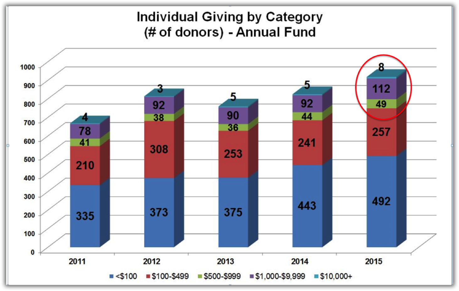
Click the image to see it full size.
This is real data from an organization that has 169 donors who contribute $500 or more.
- 49 people give at $500 to $999
- 112 people give at $1000 to $9999
- 8 people give at $10,000 and above
- 749 people give at $499 and below
Having this data displayed in a chart allowed the staff and fundraising committee to know exactly who to pay attention to and it wasn’t just the people at the top giving levels. They found that some of their donors giving in the $100 to $499 category had given the same exact amount for more than 5 years. It appears those supporters may not yet be inspired to give more.
2.) Total Dollars Raised in Each Giving Category
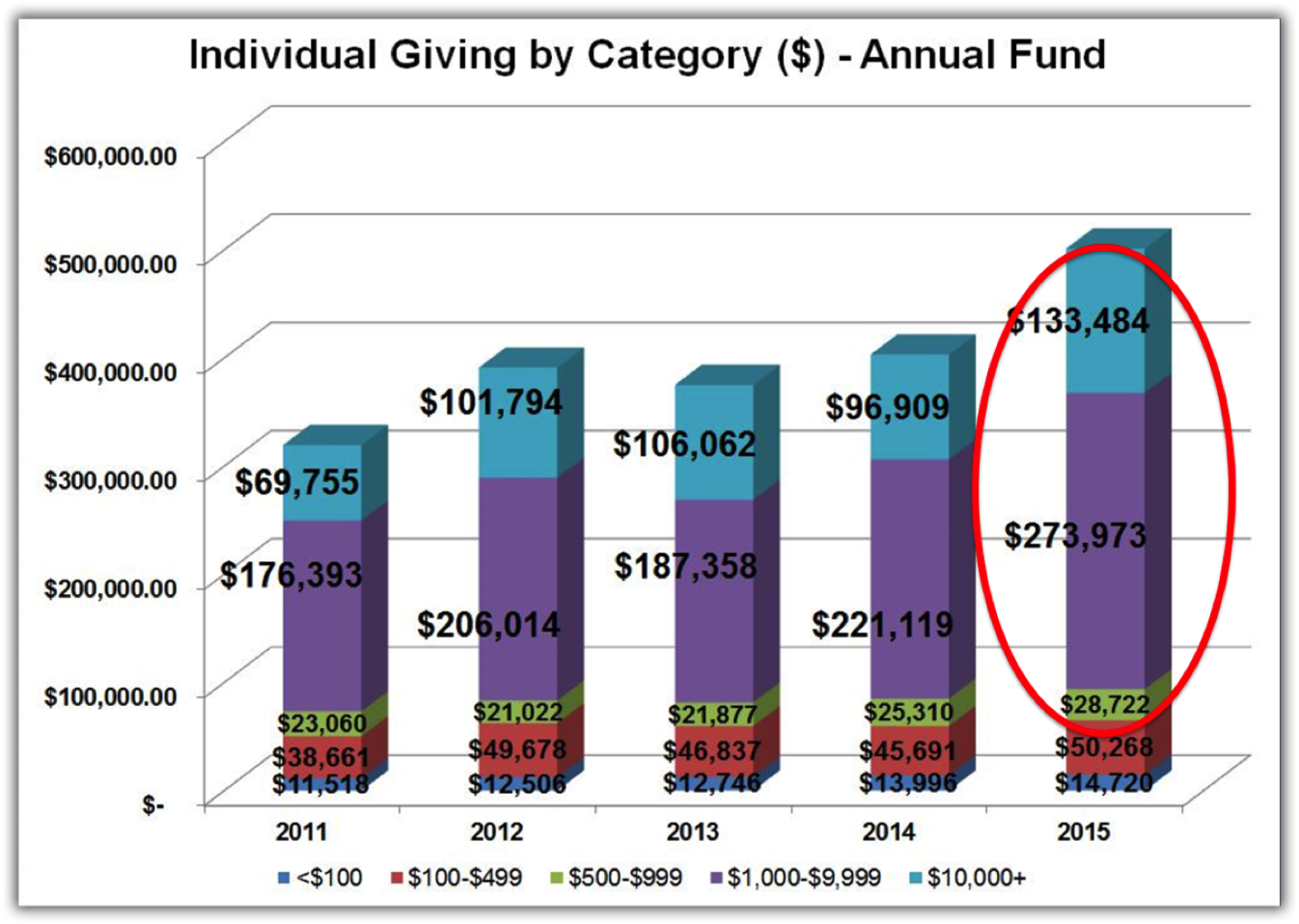
Click the image to see it full size.
Again, the real data from this organization shows they raise $407,457 from their top 3 giving levels from 169 donors.
$79,989 comes from the bottom 2 levels of giving: less than $100 and $100 to $499.
While they have 749 people contributing at the bottom two levels — that total giving only equals $64,988.
Now this organization can see that by adding just a few donors at the top three levels they will exponentially increase their annual individual donor revenue.
3.) Retention vs. Acquisition
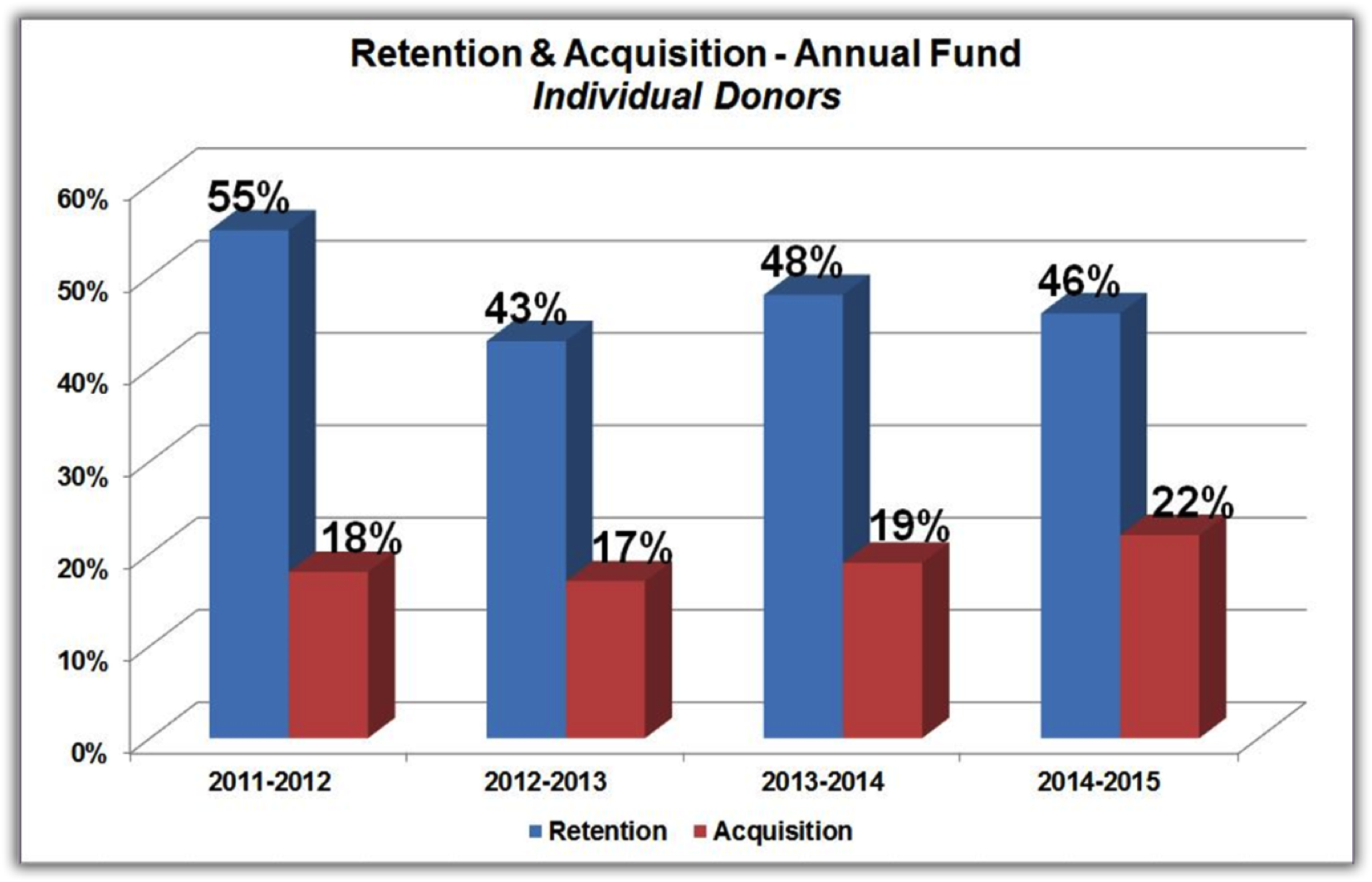
Click the image to see it full size.
The final chart to review is your annual donor retention vs acquisition for the past 4 to 5 years. Check out this video for help creating this type of chart.
Again, this is data from the same organization as the previous two charts. What it told them is they are not adding an adequate number of new donors each year. They also saw that they can increase their annual fundraising revenue by retaining more of their annual donors.
By learning who their donors are in the $1000 to $10,000 category (The Missing Middle) they have the potential to exponentially increase their fundraising revenue.