True confession: I can be something of a nonprofit data nerd. I love how numbers can tell a story when they are presented well.
I’m a long-time advocate of using visual displays of your data to get people to take action. And, as I’ve mentioned before here in this blog, when you combine storytelling and data, I’m in heaven.
Sharing your data with your board or supporters IS important, critical even. I sometimes worry people share data few read and it certainly doesn’t cause people to take action.
Often I see board packets with information about the work done in the past — lists and spreadsheets — but the information doesn’t compel me to do anything any different.
The use of dashboards and other visual displays is one of my “soap box” topics this year. Please don’t share data that is meaningless. If the data is boring, unclear, or only talks about the past, what’s the point?
If you want to cause some action, (board members to make more thank you calls, or to have a meaningful discussion about the cash-flow situation) your dashboard must show what is so AND ignite conversation about what actions to take to change it.
At my trainings and in coaching sessions, when I show visuals like those below, staff and board members get a totally new perspective on sharing their data differently, more clearly. You can click on each of the graphics below to see a larger size.
By sharing data that tells a story board members are more engaged, donors give more, and volunteers are clear what actions to take. . . good dashboards actually make things happen.
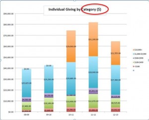
This bar graph shows Individual Giving by Category for a nonprofit organization that wanted the board to understand that there was more work to do to close out their fiscal year and reach a higher level of giving that matched previous years.
The graph was created three months before the end of the fiscal year. The good news: They exceeded their year-end goals because everyone was on board with the dollar amounts they were wanting to reach in each donor category.
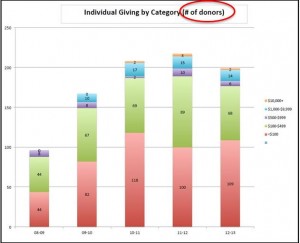
To accompany the Individual Giving graph the nonprofit organization also produced a graph showing HOW MANY DONORS were in each category.
This made it much more “doable” for the board to see how many donors to keep connected via email, phone calls, notes and invites to events.
A plan was made to engage the top 22 donors, a % of the 68 donors at the $100-$499 level and 20 or so donors who had been giving for more than four years. Each board member and key staff took responsibility for a few names/people. Giving levels increased at year-end due to their focused efforts.
The next two examples were provided by a colleague and friend of mine, Nancy J. Lee, who is a master at helping organizations with their financial and numbers story.
Nancy believes, as I do, that financials should tell a story.
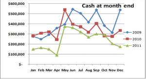
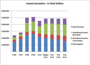
These two charts make it much more clear for the board and staff to see trends over time and to ask important governance questions about what to do to deal with the cash at month end trend and the sources of revenue.
This Income Dynamics display allowed the board to see clearly that state support was declining in time to make some changes with their contributed income revenue sources.
Decisions about staff and allocation on a major gifts program, by an engaged board kept their income from dipping into crises levels.
I’d love to see what kinds of dashboards you are using. Here are two resources to help you create effective dashboards:
Blue Avocado: A Nonprofit Dashboard and Signal Light for Boards
Beth Kanter: Dashboard Design Principles
Talk with Lori to make sure the data you are sharing isn’t a drag: Schedule your FREE 30 minute strategy session





We do a great job of sharing our story- but not so much the data. We have a dashboard for Board giving, board attendance and attendance at events. We need to share it more than twice a year. The simpler the better. Great reminder.
We have a ton of data that we’ve accumulated through the work we’ve done in our programs as well as organization/development data, but we have never really used it to help tell a compelling story or for fundraising metrics. Very helpful to have examples of how we should be using and tracking data!
I see a spreadsheet of data and get lost in a mystical forest of flying kittens. Charts and visuals would definitely be an asset in our organization. This portion of the camp brought out yet another skill/passion of someone in our organization!
We are doing a better job of working with our communications team to create compelling visual displays of our data, but still have some way to go, especially with incorporating those visuals into the current way we tell our story.
I love that you included resources to help us create the dashboards, because that was going to be my question! I really hope that we can start to use this in communications with our Board, Fund Development Committee, and staff members. It would be a great way for everyone to be more clear about what our Fund Development team does!
This is a great reminder of how we can use all the data we have and interpret it to share the story of what we are doing and how we are doing.
I am very new to my organization, however we do a great job a taking data and turning it into a number, picture, or graph that people can understand and relate to.